2017
HOLD ME
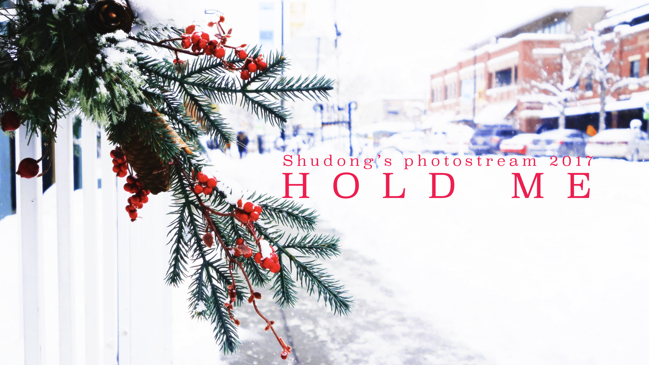
Digital from cover.
Theme Song
Since 2015, all the theme songs are from the past, but this year’s goes way more back to 1998. (Next year’s theme song goes even further back to 1995.)
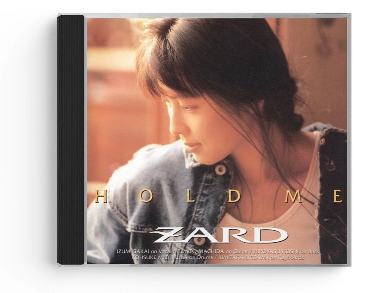
The first choice was ZARD’s 「眠れない夜を抱いて」. I forgot why I chose that one, probably because of the retro style, the seasonal feel of autumn, and other reasons. Since April that year, I’d been living in a very unique apartment, which was remodeled from a garage. The best part of it is the wall with exposed brick. It reminded me of ZARD’s 3rd album「HOLD ME」. Actually you probably already realized that this is also where the title comes from. The title text’s design, “HOLD ME“ also is a tribute to the design on the album cover.
Later on, I found an old single from Maki Ohguro, 「太陽の国へ行こうよ すぐに ~空飛ぶ夢に乗って~」, which eventually became the theme song of the year. The single was first time written by Aika Ohno, a prestigious song writer in the 2000s under the Being label. She joined the label around 1996, I think. At that time, all Ohguro’s singles were written by herself, with only one single written by Tetsuro Oda in 1994. All Ohguro’s singles topped the weekly chart, until the one written by Ohno, which has the highest ranking of only 19, the worst sales at that point. I don’t usually listen to her songs, but for this one I was just curious why its sales is so bad, and yet the songwriter is one of the best of the label. I still couldn’t figure out why, but I was attracted to the song. It has a Jazz flavor mixed in the pop style, which is kind of different than Ohguro’s hard rock style (and maybe that’s why?).
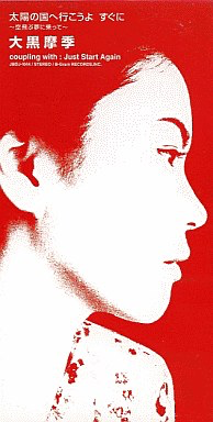
Maybe it’s a coincidence, that the cover design of the single has a very similar color palette to that of my photo album: they both use red and white as the dominating colors. It’s very nice to see they match each other.
The part of the lyrics I like most is
ささいな事に 心揺れるのは
疲れてる証拠ね
夢中で 一人走りすぎて
気付いたら 私の車だけ
The exhaustion from reality, the loneliness, the chase of dreams, and the coolness are all in these four sentences.
I believe I had been struggling between the two songs, and this lyrics is what made me choose the final one.
Another problem with theme song is the length, because I don’t have enough photos to put into the movie, I’ll have to do some cutting. Fortunately, both songs have very similar structure.
Typography
“Shudong’s photostream 2017“: Superclarendon Light
“HOLD ME“: Superclarendon Light
The original file for creating the cover, which is a keynote file I believe, has lost. Therefore, a major reconstruction work has been done at the beginning of 2022. During reconstruction, the major difficulty is the title font. The title font looks very common but with minor details, which makes it hard to identify.
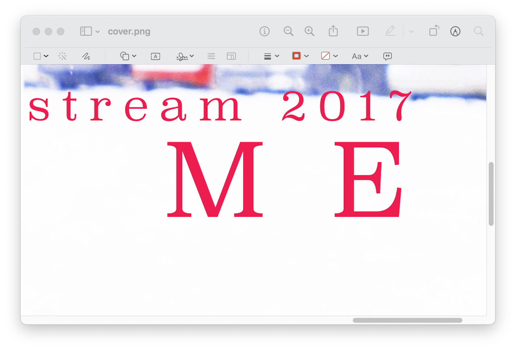
Looking at the text, I decided to start with the year, “2017“, because that’s the most distinguishable part. As you see, there’s a curve on the horizontal stroke of digit 7, as well as that of digit 2. This is very unique. Based on my experience, only some italic Serif fonts have this look.
From what I have, I tried CMU Serif Upright Italic first, because that’s the only font I know that is “upright italic“. They don’t look like the one in the picture, because the letters look very curly.
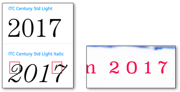
I remember this font is not very special, so I tried to think of any font name that sounds common. The Century font family came to mind. Unfortunately, this font matches the pattern of “2017“ only when it’s italic, and even so there are details that don’t match.
Another way I can figure this out is to go to Google Fonts, and type in the title text, and look over all the serif fonts, see which one matches. Again, I don’t think this is some very special font — there’s a large chance that Google Fonts have it.
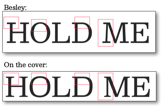
After quite a while, I finally found a font that’s close: Besley. It has all the features and looks even when it’s not italic. Something still feels off, but I thought that’s the best I can find, and I was about to go with it. But after I plugged in all the text, I noticed what’s wrong with Besley. I looks so so close, but so many details are wrong as well. For example, the most obvious one is the letter M. On the cover, the vertical lines of M are really vertical, but Besley’s are leaning inwards. Another is the letter D: on the cover, the top and bottom parts of the letter are more square-ish, more horizontal, while Besley’s are more rounded. This is the same difference for letter O. Also, I don’t really remember I’ve ever used a font called Besley; it just doesn’t ring a bell.
I know I’m close… So I googled: fonts similar to Besley. God I knew it’s there! The first one I found is Clarendon, and after typing all the text, it has everything I need! I got the font, and was ready to put it in. The text on the cover looks very thin, so I tried to use the light version. The light version of Clarendon, however, is still thicker. A search of “Clarendon ultra light“ led me to the ultimate answer: Superclarendon! It is exactly what I used, and once I saw its name I kinda know I’ve seen and installed this font on my old computer.